Over the past few weeks, we published an extensive technical breakdown covering the backend refactor currently underway for Rankbreaker. If you enjoy the long-form, deeply technical side of game development, it is absolutely worth reading through. In that post, we explained that until this refactor is complete, we will not be able to push a new build live. Thankfully, the current build remains stable while we continue rebuilding major systems behind the scenes.
Visually we’re updating Identity
If you have been following development through our Discord server, or spotted the updated hero artwork on our subreddit, you may have already noticed that Rankbreaker is finally beginning to look and feel the way we always envisioned it. Dangerous. Aggressive. Tense. The new direction draws heavily from the energy of iconic 90s fighting games while blending it with more modern design sensibilities that continue to define some of the strongest visual identities in gaming today. It is not the sort of presentation style typically associated with mobile-forward games, and that is entirely intentional. We are still designing with mobile platforms in mind, but we are moving away from the sterile corporate interface language that has dominated the space for years in favor of something that feels more like an underground fight circuit than a product dashboard.
Inspiration
A huge amount of our recent visual exploration came from revisiting classic fighting games and arcade-era action titles. Games like Street Fighter V, Guilty Gear X, The King of Fighters, and Streets of Rage all shared pieces of the energy we were searching for. We also spent time studying Mortal Kombat, but ultimately found its interface language a little too clean and restrained for the direction we wanted Rankbreaker to move toward. From there, we started pulling inspiration from older street and punk-inspired arcade games like Two Crude, along with the gritty visual identity found in classic Teenage Mutant Ninja Turtles and Battletoads titles. We even experimented with comic-book inspired presentation and revisited games like Comix Zone while trying to find the right balance between aggression and readability. What we discovered pretty quickly was that the harder we pushed toward interfaces that literally looked like physical buttons and comic panels, the more the game started feeling dated in the wrong ways instead of timeless.
Of course, one of the realities of building a game is that every visual element has to feel cohesive. By the end of 2025, we genuinely believed we had achieved that. Menus matched the cards, the cards matched the world, and the overall presentation shared a consistent visual language from top to bottom. On paper, it all worked. The problem was that something kept nagging at us every time we opened the game. It looked polished, but it did not feel right. There was a certain je ne sais quoi missing from the experience. The older presentation felt too clean, too controlled, almost too careful. Nothing about it created tension or demanded a reaction. It felt flat. Lifeless. Like it was missing a pulse we could feel but could not fully identify.
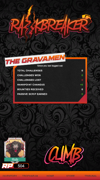
What we eventually realized was that the biggest thing holding the game back was our commitment to safety. We had spent years making careful decisions. Minimal risks. Constant clarity. Wording that stayed clean, readable, and inoffensive at all times. Under scrutiny, those choices sounded responsible. Under actual application, they drained the personality out of the game. After losing a match, players could place a bounty on the opponent who defeated them. Mechanically, it worked perfectly. The button said “Add Bounty” because that is technically what the action was. It was also completely lifeless. Generic. Forgettable. So we started reevaluating every single piece of language in the game and asking ourselves a very simple question: does this sound like Rankbreaker, or does it sound like software?
“Add Bounty” became “Buy Revenge” because that is what the player is actually doing. You are paying someone else to hunt down the person who just beat you. Once we crossed that line creatively, the rest of the game started opening up with it. The “Store” became the “Market.” “Claim” became “Redeem.” Factions evolved into Legions. Cards became Codices. Sets became Folios. What started as a visual redesign quickly became something much larger. We were not just rebuilding the visual identity of Rankbreaker. We were rebuilding the language of the world itself.
Gone is the Pink and Blue
The older Rankbreaker logo revolved around the pink and blue double slash that symbolized the climb up or down the ladder. Conceptually, it made perfect sense. The cleaner lines and more corporate presentation reflected the internal lore of the world itself, a society built around the endless expansion of the Trophaeum where centuries of conflict eventually evolved into a hyper-commercialized spectacle fueled by sponsorships, gambling, and cyberpunk-era capitalism. The lore still works. In many ways, the original branding fit that world exactly the way it was supposed to. The problem was that while the logo matched the corporations inside the universe, it did not fully match the feeling of actually playing Rankbreaker. Climbing the ladder in Rankbreaker feels less like navigating a clean corporate ecosystem and more like surviving a violent underground battle royale. Rival crews fighting through neon-soaked alleyways. Competitors throwing punches for reputation, revenge, and dominance. Once we realized that disconnect, the visual direction became much clearer. The pink and blue were stripped back in favor of aggressive oranges and heavier yellows, while traces of pink remained around the edges to add heat, contrast, and depth instead of defining the entire identity.
What ultimately changed was not the overall structure of the interface, but the attitude behind it. We intentionally kept the core layouts familiar because the last thing we wanted was for players to feel like they were solving a new puzzle every time a different screen loaded in. Readability and usability still matter. The difference is that we stopped sanding every edge down in the name of safety. The newer interface language introduced sharper shapes, heavier framing, and more deliberate aggression throughout the presentation. We stopped treating buttons as simple square containers with updated text pasted onto them and started redesigning the buttons themselves to carry the same energy as the rest of the game. Every interaction needed to feel like it belonged inside Rankbreaker instead of floating above it like generic application UI.
What is interesting is that there are already real-world examples of the exact kind of energy we were trying to capture. The tabletop roleplaying game Mörk Borg is widely regarded as one of the strongest examples of graphic design being used as part of the emotional experience itself rather than simply decoration layered on top. The same thing happened with concert posters and tour branding throughout the mid 2000s, especially in punk, metal, and hardcore scenes where every flyer looked loud, dangerous, and overflowing with personality before you even heard a single song. That was the feeling we kept coming back to during this redesign process. We did not want Rankbreaker to look sterile or over-optimized. We wanted it to feel like something with pressure behind it. Something expressive. Something that looked like it had a pulse.